What is Custom Image?
All PENTAX digital SLR cameras currently on the market feature the creative Custom Image function,* which lets you alter the finishing touch of an image you’ve captured, just like changing the film type. In addition to the easy selection of the Custom Image mode best suited for a given scene or subject — one of the great advantages of digital photography — it also gives you the flexibility of customizing any selected Custom Image mode by shifting various parameters.
* All the features and functions introduced in this article are based on PENTAX digital SLR cameras available as of June 2022. Older models may not provide some Custom Image modes and/or functions.
Distinctive features of Custom Image modes
Bright
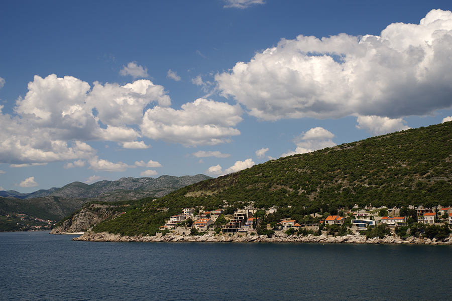
Ideal for all types of scenic photography, this all-purpose mode emphasizes deep-blue skies and fresh, lively green leaves. Similar in appearance to one of the finishing touches featured in the *ist DS, this mode produces a solid image rendition symbolic of PENTAX colors, and is preferred by 60 percent of PENTAX camera users.
〔Custom Image:Bright〕
〔Custom Image:Natural〕

Slide the bar to compare
In comparison with the Natural mode, which provides a better overall color balance, the Bright mode provides a clear difference in the reproduction of blue skies and green leaves. Contrast and Sharpness parameters are set at -1 at default to enhance overall contrast.
〔Custom Image:Bright〕
〔Custom Image:Natural〕

Slide the bar to compare
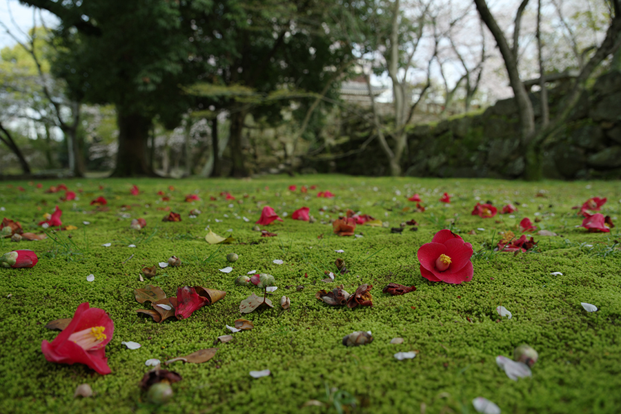
The Bright mode not only enhances green tones, but also dramatizes red tones.
Natural
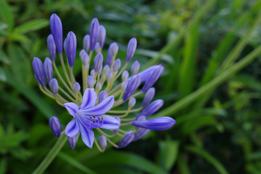
Ideal for all types of subjects, this mode provides a good balance of brightness and saturation for each light level, while assuring lively color reproduction that is true to the PENTAX tradition. This classic Custom Image mode is similar in appearance to one of the finishing touches first introduced with the *ist D, PENTAX’s first digital SLR camera.
〔Custom Image:Natural〕
〔Custom Image:Bright〕
Slide the bar to compare
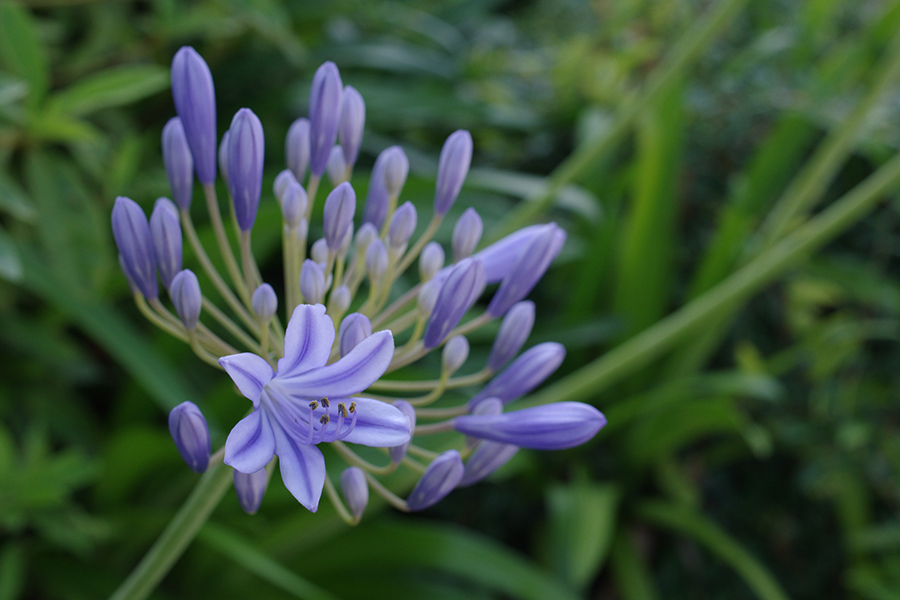
Because the Bright mode provides low saturation in the brightness of blues, but high in the saturation of other colors, it tends to lose subtle shades in the subject. The Natural mode is ideal when you prefer neutral color reproduction.
〔Custom Image:Natural〕
〔Custom Image:Bright〕
Slide the bar to compare
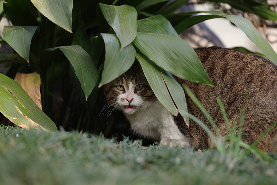
Choose this mode for scenes in which the Bright mode would completely lose detail in shaded areas due to high-contrast reproduction — for instance, outdoor scenes in bright sunshine, and subjects requiring depiction of soft texture, such as an animal’s fur.
Portrait
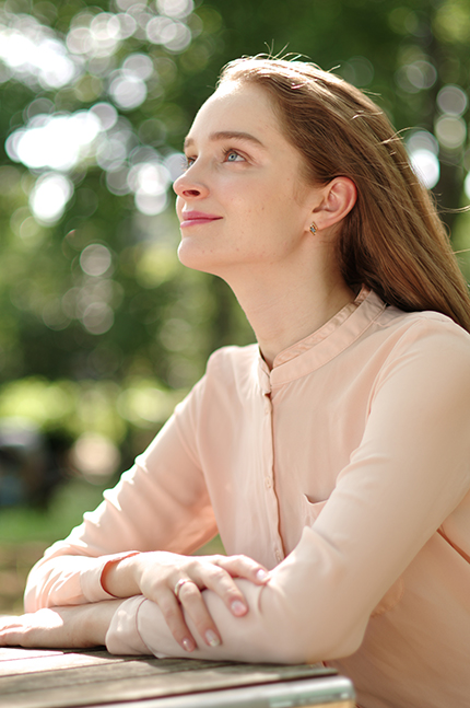
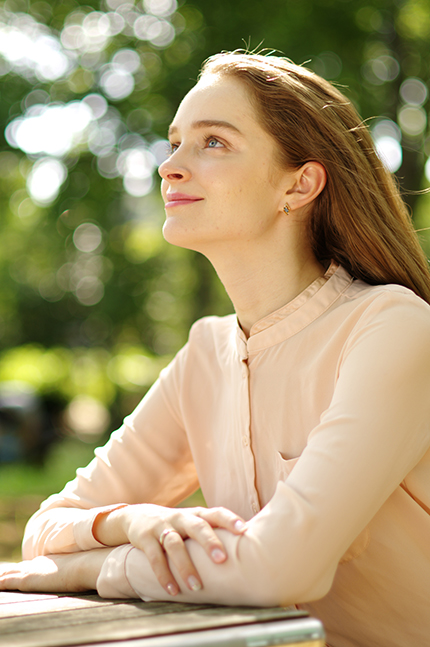
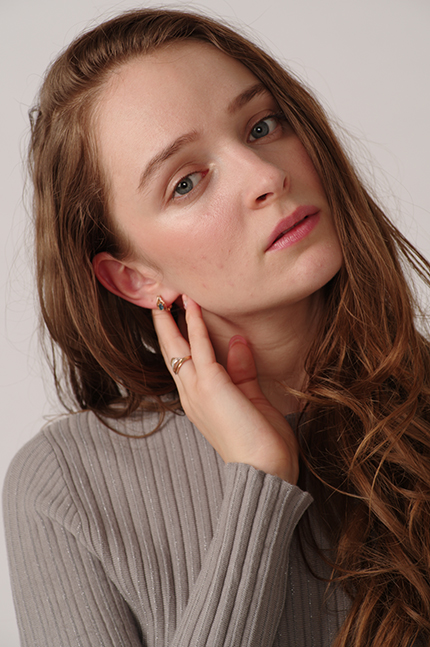
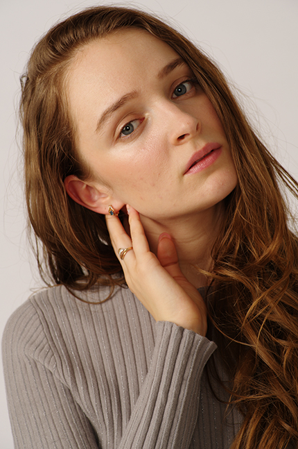
Designed to capture lively portraits, this mode emphasizes magenta shades to create healthy skin tones in the subject. When you can’t decide which mode to use in portrait photography, try this mode first.
〔Custom Image:
Portrait〕
〔Custom Image:
Bright〕
Slide the bar to compare
〔Custom Image:
Portrait〕
〔Custom Image:
Bright〕
Slide the bar to compare
Rather than being faithful to the original colors, this mode captures the subject’s skin with slightly pinkish tones. When taking portraits in the studio, you may want to slightly reduce the saturation and contrast levels by using the Custom Image parameter setting function.
Landscape
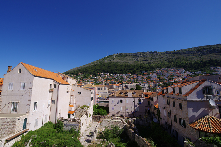
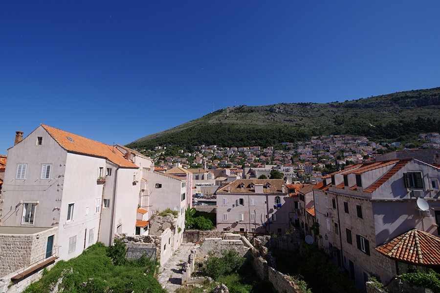
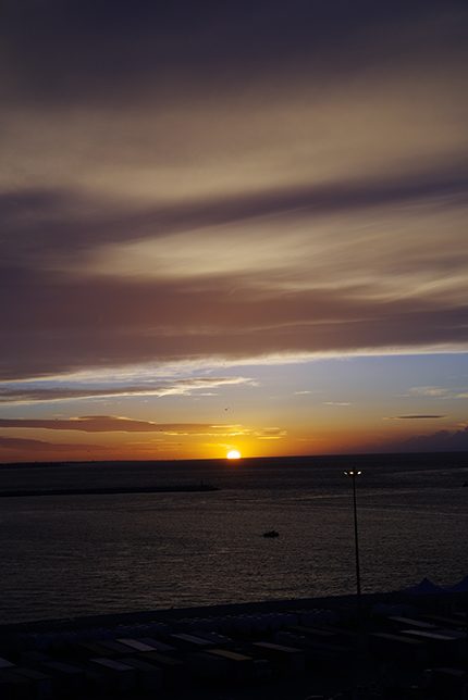
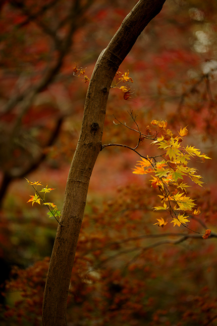
Using the scenery-oriented Bright mode as its base, this mode produces richer blue and green shades. It also enhances yellow to dramatize colored leaves in autumn.
〔Custom Image:
Landscape〕
〔Custom Image:
Bright〕
Slide the bar to compare
Since this mode is principally based on the Bright mode, the overall impression of captured images may not vary much, even though you can detect the difference in the scarlet tones of roofs and the greens in leaves. You can use these two modes interchangeably to suit your preference.
〔Custom Image:
Landscape〕
〔Custom Image:
Bright〕

Slide the bar to compare
Compared with the Bright mode, this mode retains yellow hues in the highlight areas of the setting sun. Since these two modes are basically very similar in characteristics, you can choose the one that recreates desired colors.
〔Custom Image:
Landscape〕
〔Custom Image:
Bright〕
Slide the bar to compare
These modes are perfect for reproducing the rich colors of autumn leaves.
Vibrant
This mode provides a finishing touch that emphasizes three primary colors — blue, green and red — to capture lively images of nature and scenery. Magenta-tinted blues create a clear, profound atmosphere, while the pure reds accurately reproduce the vivid vermillion of torii gateways at shrines. This mode is also useful in capturing scenes requiring true-to-life reproduction of magenta tones, such as the slightly purple-tinted skies found at twilight.
〔Custom Image:
Vibrant〕
〔Custom Image:
Bright〕
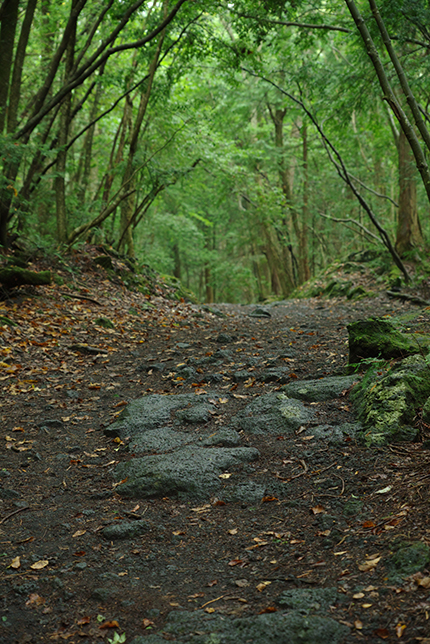
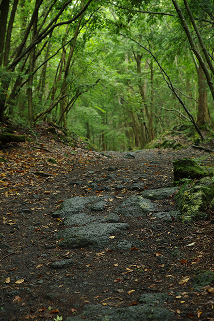
Slide the bar to compare
Slightly cyan-tinted bright greens are similar to the colors detected by the naked eye, and are ideal for expressing fresh, lively green leaves in spring.
〔Custom Image:
Vibrant〕
〔Custom Image:
Bright〕
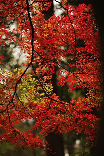
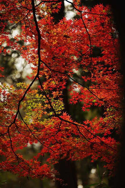
Slide the bar to compare
When capturing autumn scenes, this mode produces colors slightly lighter than those of the Bright mode, delivering a more vibrant, livelier finishing touch.
〔Custom Image:
Vibrant〕
〔Custom Image:
Bright〕
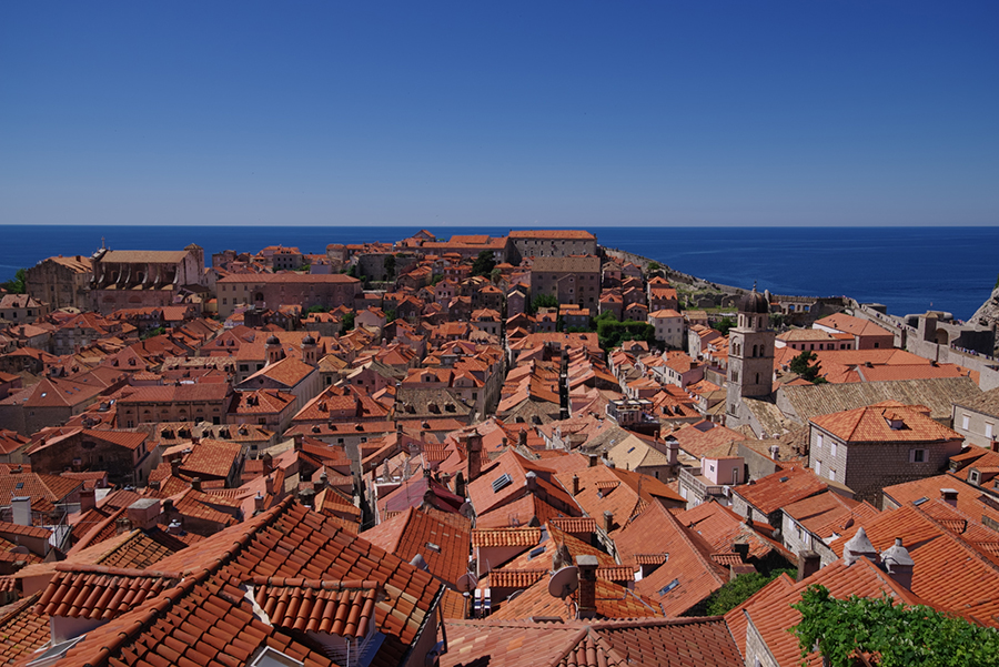
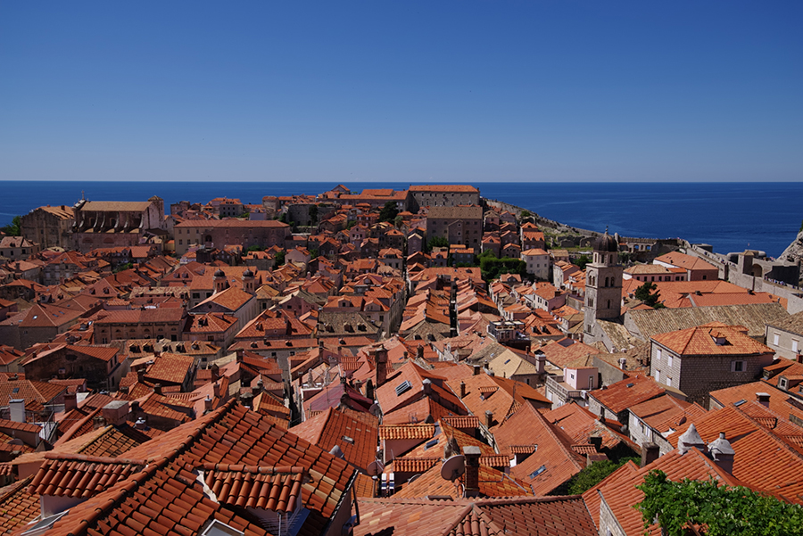
Slide the bar to compare
Compared with the Bright mode, this mode recreates the sky with richer blues and a slightly brighter overall tone.
〔Custom Image:Vibrant〕
〔Custom Image:Bright〕
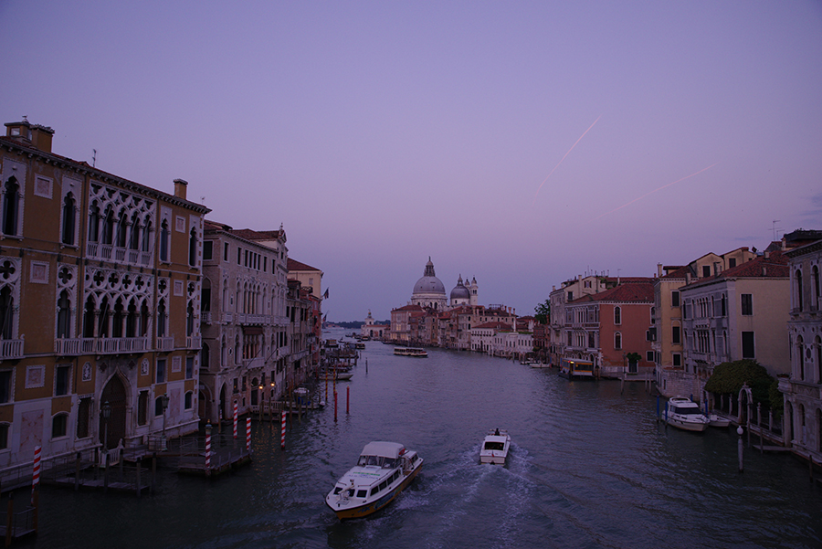
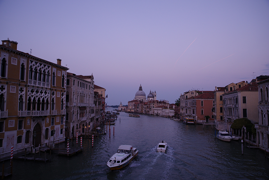
Slide the bar to compare
This mode provides a more dramatic finishing touch for slightly purple-tinted skies at twilight, more so than high-saturation Custom Image modes such as Bright and Landscape.
SATOBI
A Custom Image that provides a finishing tone similar to color photos from the 60 and 70s with colors such as distinctive cyan blue, dull yellow, and faded red.
The unique red expression is suitable for such as portrait photography. It conveys the image of a dry and desolate land and allows you to enjoy the expression of faded colors that bring back nostalgic memories of places.
〔Custom Image:
SATOBI〕
〔Custom Image:
Bright〕


Slide the bar to compare
The shades of the cyan blue sky and the texture of weathered rusted metal create a feeling of nostalgia and loneliness.
〔Custom Image:
SATOBI〕
〔Custom Image:
Bright〕

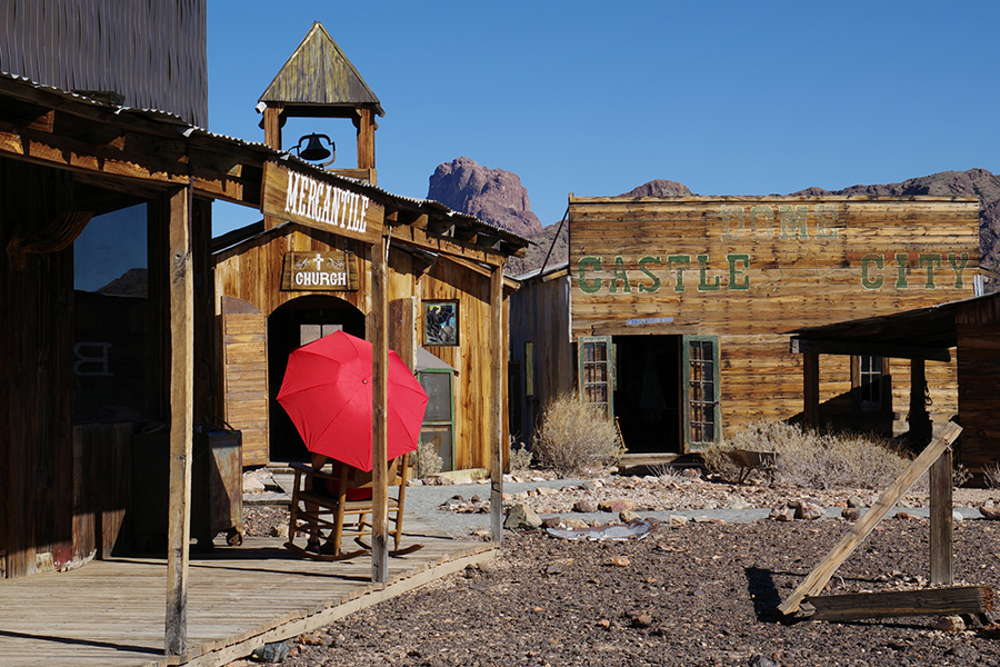
Slide the bar to compare
The expression that makes the red umbrella appear faded is distinctive. This Custom Image even enables you to feel the dry soil.
〔Custom Image:
SATOBI〕
〔Custom Image:
Bright〕
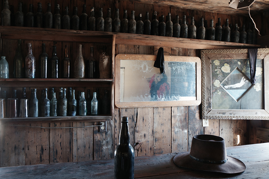
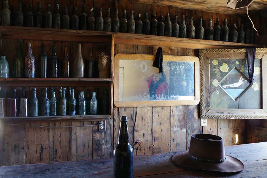
Slide the bar to compare
The texture of weathered buildings and unique shades of color with low saturation provide a finish that feels as though the flow of time has completely stopped.
Radiant
Even when compared to the color-rich finishing touches created by Bright, Landscape and Vibrant modes, this mode produces a truly distinctive finishing touch. High in saturation and contrast, it is designed to exaggerate each hue by raising initial key settings and deliver brighter images. Although this mode is characterized by its eye-catching color reproduction, it’s also useful in adding contrast to scenes set under flat-lit, cloudy skies.
〔Original image
(Custom Image:Bright)〕
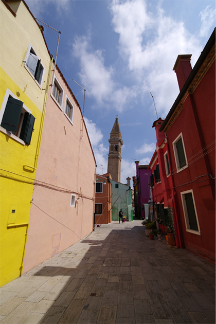
Although the street is lined with richly colored buildings, the image captured by the Bright mode appears rather subdued.
〔Custom Image:
Radiant〕
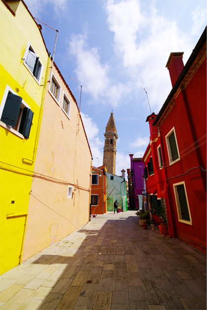
By selecting the Radiant mode, you can capture a lively atmosphere more truthfully. Since the keys are set rather high at default, it provides a brighter finishing touch, especially for the neutral tones.
〔Original image
(Custom Image:Bright)〕
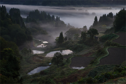
In this predawn scene, the Custom Image mode was set to Bright, while the exposure was shifted to slightly underexpose an image to bring out the mist. Because there is little illumination, however, the freshness of the green leaves and other details has been lost.
〔Custom Image:
Radiant〕
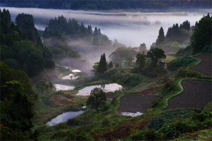
By selecting the higher-saturation Radiant mode, green leaves are reproduced more colorfully. Thanks to higher key settings, neutral tones and details are depicted more clearly and vividly. This mode is effective with scenes which standard finishing touches cannot fully describe because of an insufficient light level.
Muted
This mode produces a high-key, low-contrast finishing touch with toned-down saturation. The Key parameter of the Custom Image minute setting menu was added to reproduce the finishing touch of this Muted mode. It retains core colors ever after Saturation, Key and Contrast parameters have been adjusted. This mode also enables you to choose a tone from eight color options and shade the entire image with that particular tone to create a totally different finishing touch.
〔Tone:None〕
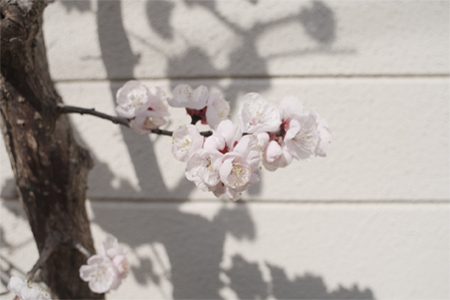
Captured in harsh sunlight, this image has rather dark shadows. In order to depict the lovely flowers, the Custom Image mode was set to Muted, with high-key, low-contrast parameters to produce a warm finishing touch.
〔Tone:Yellow〕
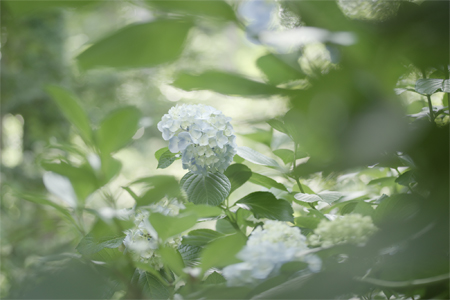
Captured with a macro lens, this image has rather sharp details. By selecting the Muted mode and adding a yellow tone, the image was softened, as if captured under mild sunshine.
〔Tone:Cyan〕
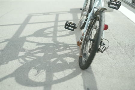
By adding a blue tone, the image was finished with a daydream-like impression. The Muted mode comes in handy in recreating a nostalgic atmosphere.
Flat
This Custom Image mode is designed with a retouching process in mind. Contrast is set to -4 at default to minimize contrast. Since it produces true-to-life images without color expansion, it simplifies post-shooting retouching work.
〔Original image(Custom Image:Flat)〕
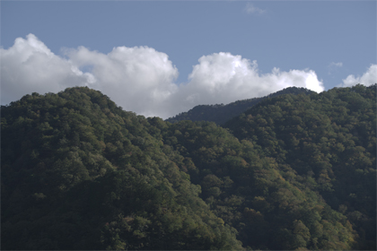
The parameters of the Muted mode are initially set low to reduce contrast. Because an image captured in this mode retains color data, it serves as a highly manageable photo material.
〔After retouching the JPEG-format image〕
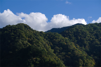
A JPEG-format image captured in the Muted mode is edited using a retouching application, raising the contrast and saturation levels and changing the blue tones in the sky. The image is effectively retouched, without excessively changing its overall impression.
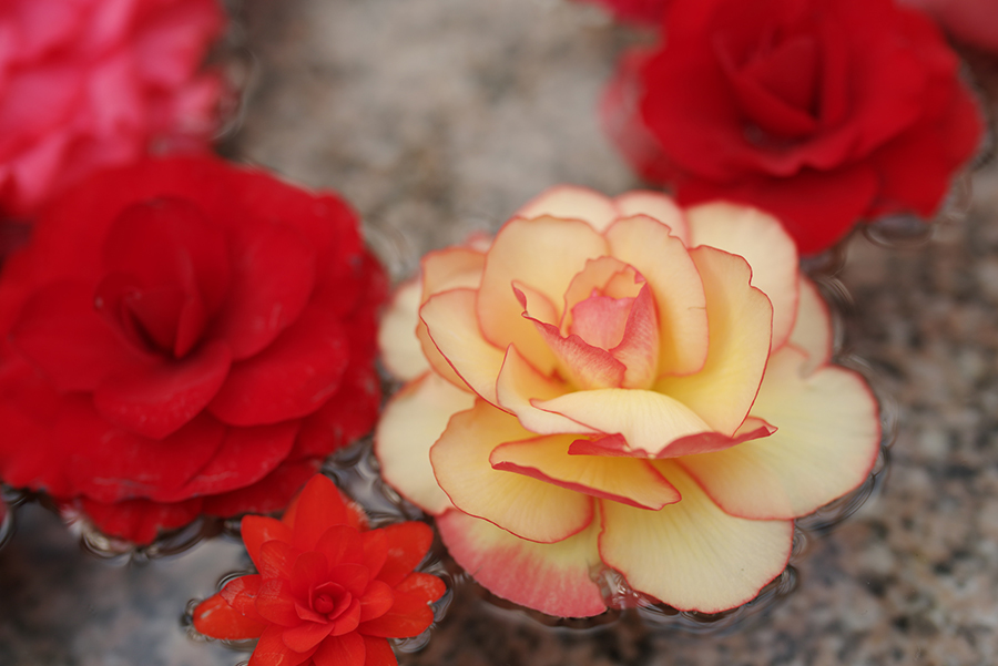
〔Custom Image :Flat
(saturation and contrast 0)〕
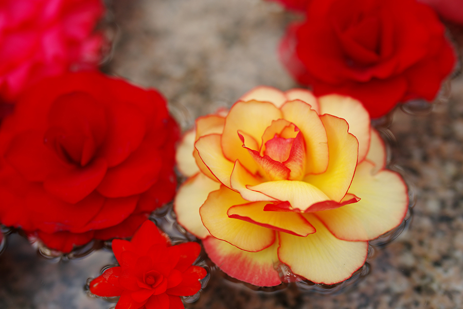
〔Custom Image:
Bright〕
Slide the bar to compare
Since this mode applies no color expansion, you can raise the Contrast parameter, which is set to the under side at default, and use it as a Custom Image mode which delivers true-to-life images close to those detected by the naked eye.
Bleach Bypass
This mode recreates low-key, high-contrast images with subdued colors, just like old films developed by the bleach bypass process. Although the Tone parameter is set to green at default, you can turn it off or change it to a different tone to experiment with various bleach bypass effects.
〔Tone:Green〕
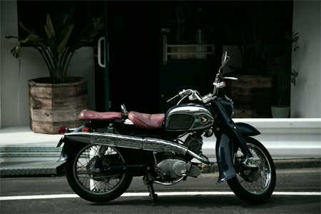
A motorcycle parked on the street is captured in a dramatic image. Since the Bleach Bypass mode produces a finishing touch with high contrast and subdued colors, it’s well suited for subjects such as metallic objects.
〔Tone:Cyan〕
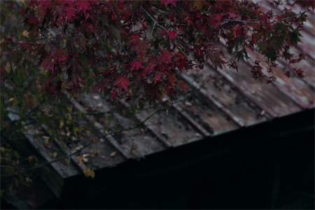
This image depicts autumn leaves that have fallen on a rusted zinc-coated roof. By opting for a low-key expression, all dark areas are captured in subdued colors for simplified composition.
〔Tone:Blue〕
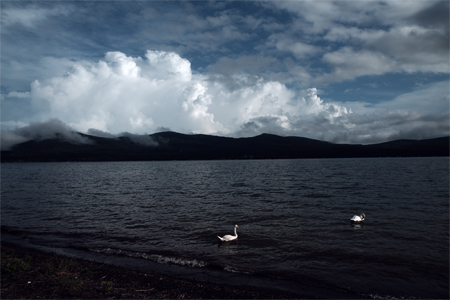
Since the image is captured in just a few colors, the white in swans and clouds stands out. The Bleach Bypass mode provides a distinctive color expression, especially by depicting blue skies with refined colors.
Reversal Film
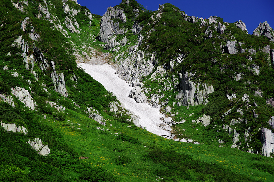
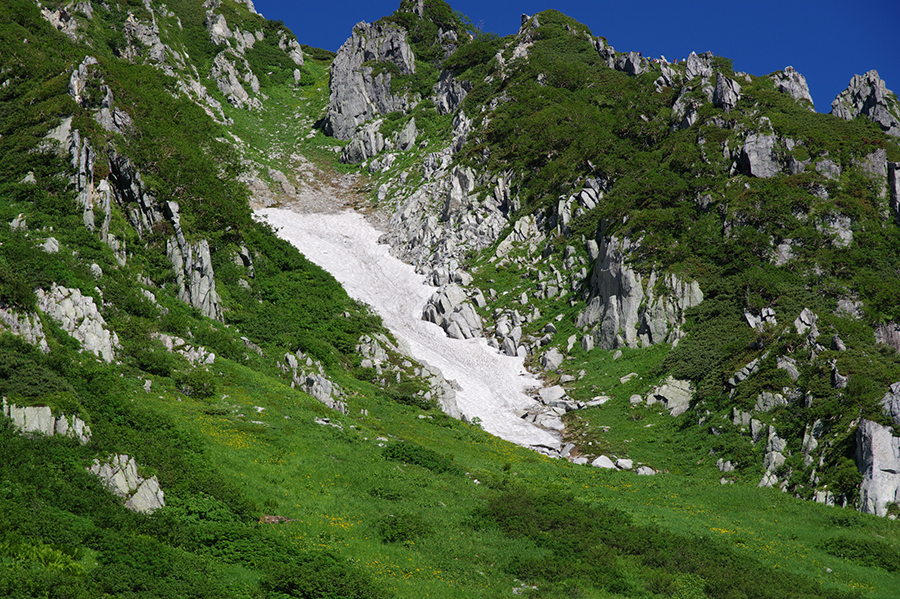
This mode is designed to express images with deep black and rich colors, just like those captured on reversal film. Its unique tone curve produces distinctive shades. It reproduces rich, true-to-life colors via contrast adjustment, rather than by arbitrarily raising the saturation level. To simulate the actual reversal film development process, it provides no adjustment function for Brightness, Contrast, Saturation and other parameters (except for Sharpness in minute setting function).
〔Custom Image:Reversal Film〕
〔Custom Image:Bright〕
Slide the bar to compare
Since low-key images often have shadow areas that lack details, exposure control is a concern. The Reversal Film mode emphasizes green tones to produce sharp-contrast images.
Monochrome
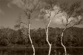
This mode produces rich-gradation, monochrome images in black and white, or sepia. In addition to contrast control, you can also select the desired tone — pure black, warm tone and cool tone — to create a different impression for your image. With eight monochrome filters to choose from, you can even capture different types of images, as if photographing with monochrome film.
〔Default setting〕
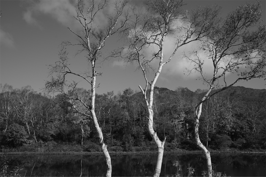
The standard tone curve is similar to that of Natural mode. Since there is no bias in brightness for each color, you can easily visualize the effect of the monochrome filters. Since these filters darken the areas with a color complementary to the filter effect name on the menu, they can partially raise contrast in those areas.
〔Warm tone〕
〔Cool tone〕
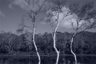
By adding a certain tone to the image, you can create a sepia-toned image or a blue-tinted, cool-tone image. You can even adjust the tone, step by step, to create the desired effect.
〔Filter: yellow〕
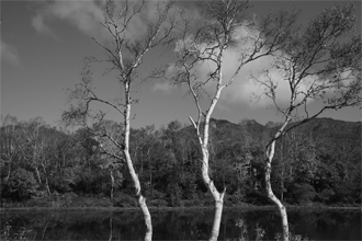
By setting the monochrome filter to yellow, you can lower the brightness of the blue sky — blue being the complementary color of yellow — to raise the contrast of the sky.
〔Filter: infrared〕
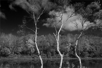
This filter creates an infrared film effect, making the blue sky appear darker and the green leaves brighter and whiter.
Cross Processing
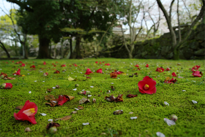
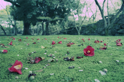
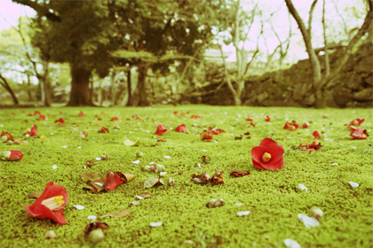
This mode produces a finishing touch with distinctive colors and unique contrast, just like that created by the cross-processing technique in film. At default, it’s designed to shift the parameters of the finishing touch for each image, providing unexpected film development outcomes to digital images.
〔Original image
(Custom Image:Bright)〕
〔Sample 1:Blue tone〕
〔Sample 2:
Yellow tone〕
〔Sample 3:Red tone〕
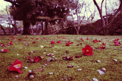
When you want to standardize the finishing touch for captured images, you can choose the preset mode from the menu and select one of three preset tones. You can even select as many as three favorite tones captured by the Cross Processing mode, and register them on the camera for instant recall.
Gold
With scenes accentuated by light, this mode is designed to create gold-tinted images by applying yellow-toned finishes to brighter areas With scenes accentuated by light, this mode is designed to create gold-tinted images by applying yellow-toned finishes to brighter areas while expressing darker, shadow areas with bluish tones. Yellow tones become more intense in highlighted areas.
〔Custom Image:Gold〕
〔Custom Image:Bright〕
Slide the bar to compare
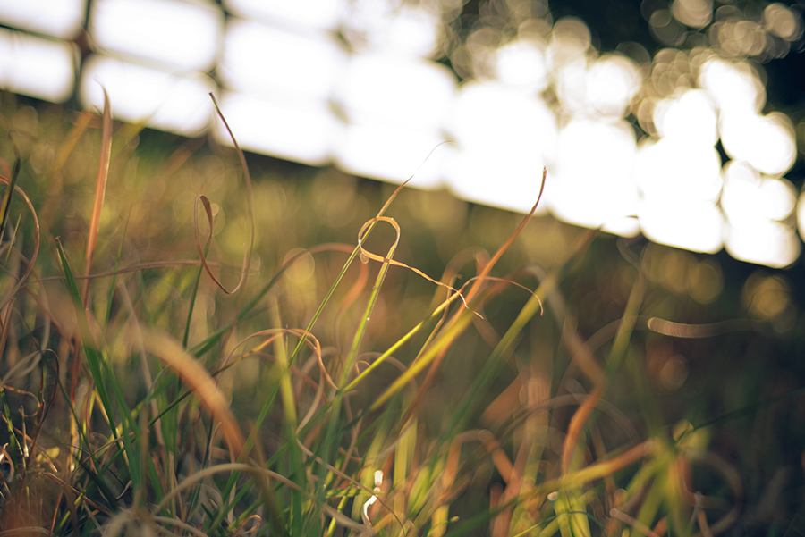
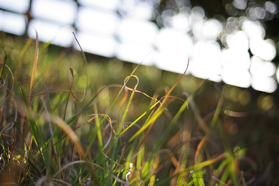
Strong sunlight is expressed with yellow-toned finishes, creating an impression of glittering rays of sun. Since the entire image is coated with yellow tones, it suggests the ambience of an image being captured at dusk.
〔Custom Image:Gold〕
〔Custom Image:Bright〕
Slide the bar to compare
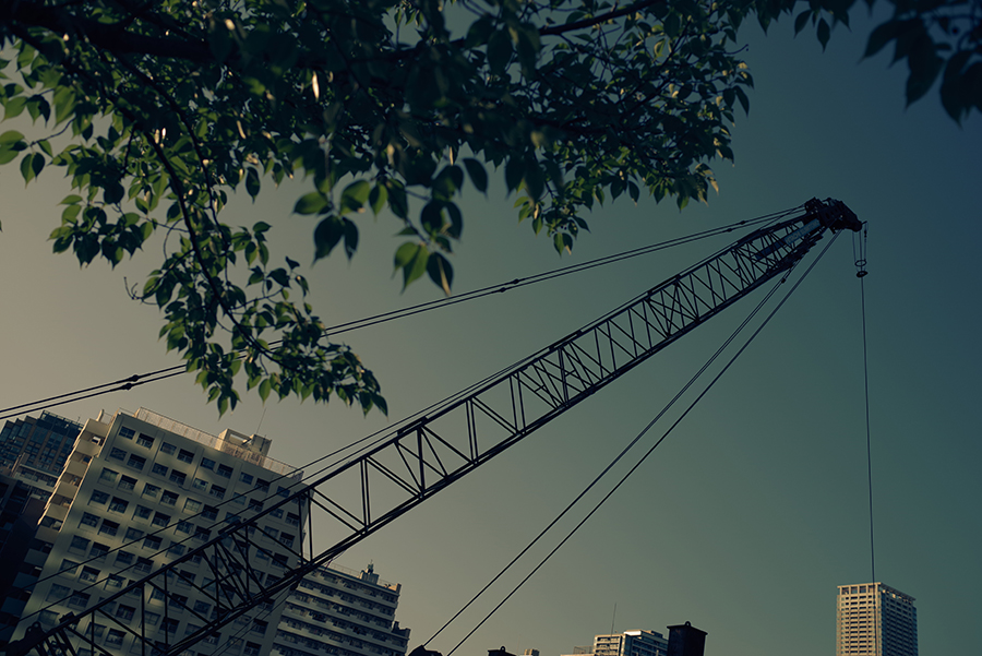
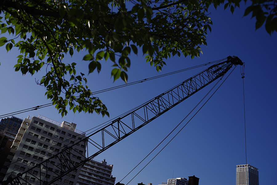
The image tone gradually shifts from blue in the shadows to yellow towards the highlights. The Gold mode can create intriguing images with unique nuances, even with ordinary, everyday scenes.
〔Custom Image:Gold〕
〔Custom Image:Bright〕
Slide the bar to compare
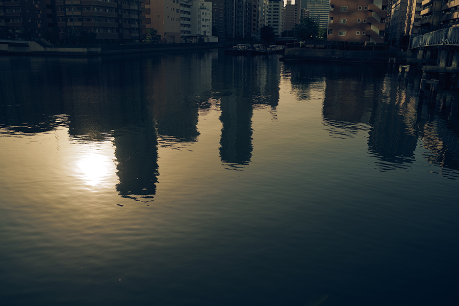
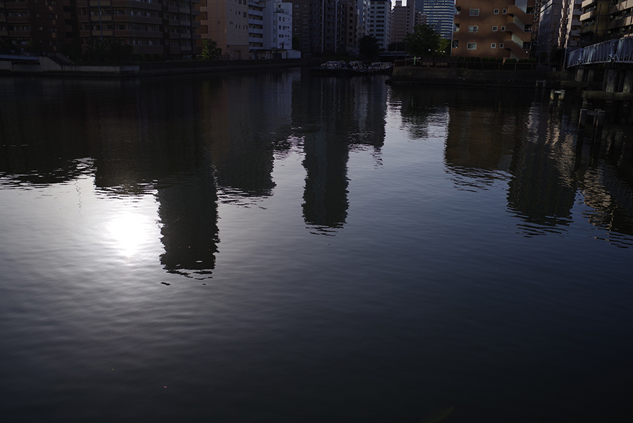
Since the image’s tone gradually shifts from blue in the shaded surface of the water to yellow towards the highlights, subtle nuances on the surface are more emphasized to dramatize the image. The yellow-toned finishes in the highlight areas also emphasize the reflections of the sun.
〔Custom Image:Gold〕
〔Custom Image:Bright〕
Slide the bar to compare
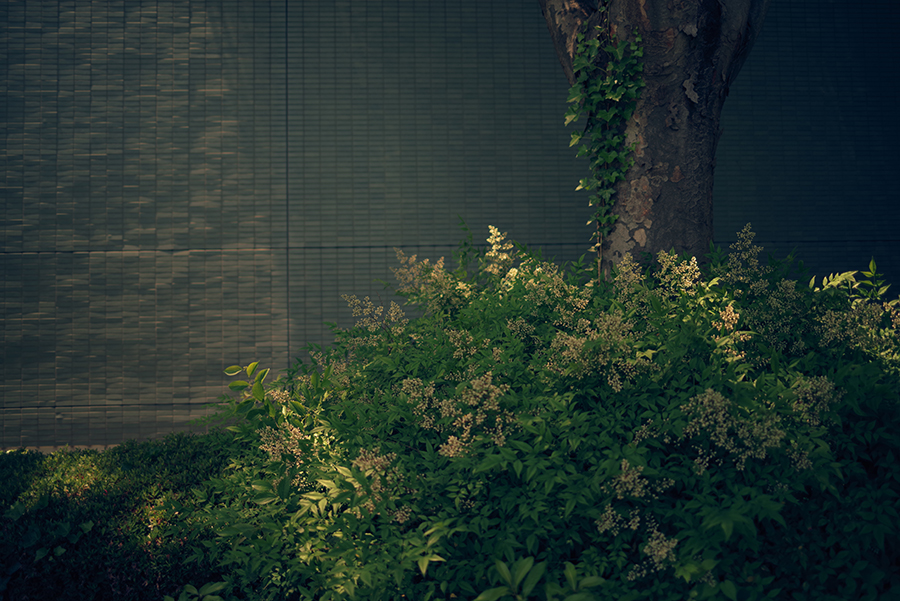
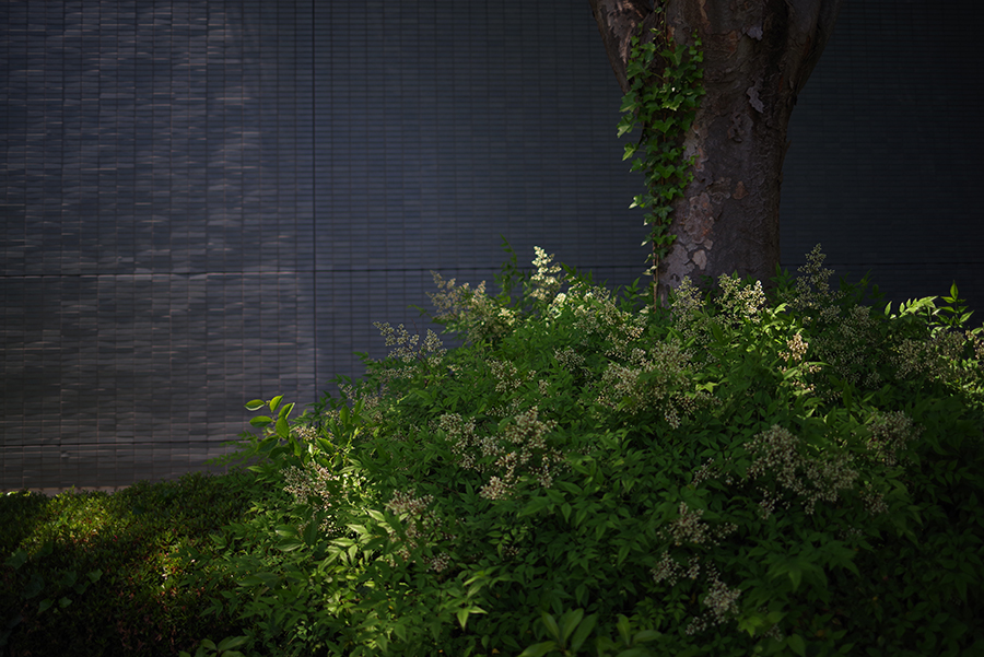
In the Bright mode, a deep black tone helps emphasize the three-dimensionality of the trees. In the Gold mode, however, the shadow area is expressed with bluish tones to create a flat, monotone visual effect across the image, while downplaying the importance of three-dimensionality.


